Painting With Light: How America's Master Photographers Harness Color as a Silent Storyteller
Painting With Light: How America's Master Photographers Harness Color as a Silent Storyteller
Before a viewer reads a caption, before they register a face or a landscape, they feel color. It arrives first — visceral, immediate, and deeply associative. For the professional photographer, this is not merely an aesthetic consideration. It is a strategic one. Color functions as a visual language, and learning to speak it fluently may be the single most transformative skill a photographer can develop.
Across the United States, the sheer geographic and cultural diversity of the land provides photographers with an extraordinary chromatic vocabulary. The question is not whether color is present — it always is. The question is whether you are choosing it, or simply accepting it.
The Foundations: Understanding What Color Actually Does
Color theory, at its core, is the study of how colors interact, contrast, and communicate. Rooted in the work of figures like Johannes Itten and Josef Albers, it has been absorbed into virtually every visual discipline — from interior design to cinema. For photographers, three concepts are especially foundational.
Hue refers to the pure color itself — red, blue, yellow, and so on. Saturation describes its intensity, the difference between a muted sage green and a blazing emerald. Value concerns lightness and darkness, the tonal weight a color carries within a frame.
Beyond these basics, color relationships matter enormously. Complementary colors — those opposite each other on the color wheel, such as orange and blue — create tension and visual energy when placed together. Analogous colors, which sit adjacent on the wheel, produce harmony and flow. Monochromatic palettes, built around a single hue in varying tones, lend images a meditative, unified quality.
Understanding these relationships allows a photographer to move from reactive shooting to intentional image-making.
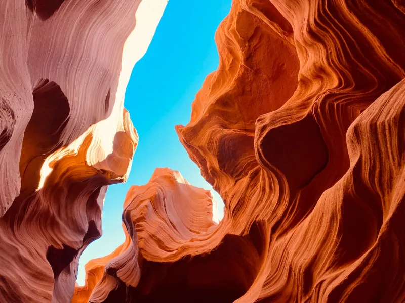
The American Southwest: When Saturation Becomes Statement
Few environments on earth offer the kind of chromatic intensity found across Utah, Arizona, and New Mexico. The iron-rich sandstone formations of Monument Valley burn with deep reds and burnt oranges, particularly in the hour following sunrise. The turquoise inlay of Navajo jewelry against sun-bleached adobe walls creates complementary contrasts that require almost no editorial intervention — they exist as found compositions.
Photographers working in this region often lean into high saturation deliberately, allowing the landscape's inherent drama to carry emotional weight. The effect is one of urgency and heat, a sense that the earth itself is alive with energy. This is color as intensity — as a means of conveying the overwhelming physicality of a place.
When building a palette inspired by the Southwest, consider anchoring your edits around warm earth tones: terracotta, sienna, and ochre. Use deep shadow blues as counterpoints to prevent the image from reading as flat or overly warm. The interplay between those extremes is where the visual tension lives.
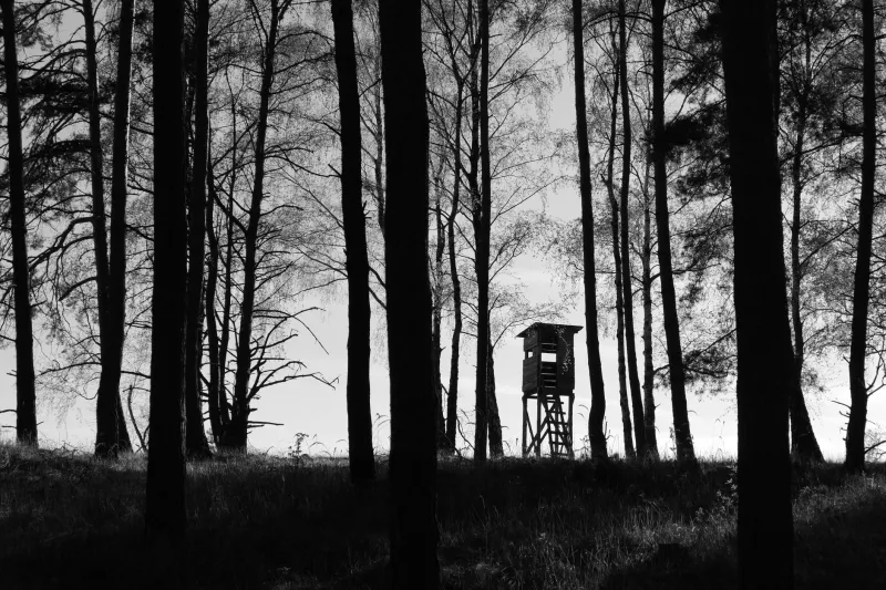
The Pacific Northwest: Restraint as a Chromatic Philosophy
Travel north to Washington State or coastal Oregon, and the chromatic register shifts entirely. Here, color is subdued — desaturated greys, deep forest greens muted by perpetual moisture, the silver-blue of fog rolling off the Pacific. Photographers like Art Wolfe, whose work frequently draws on the landscapes of the Pacific Northwest, have demonstrated how restraint in color can be just as expressive as vibrancy.
Muted palettes carry their own emotional vocabulary: introspection, melancholy, stillness. When a photographer chooses to preserve the natural desaturation of a foggy coastal morning rather than boost the colors in post-processing, they are making a deliberate editorial statement. They are saying: this is what solitude looks like.
To develop a Pacific Northwest-inspired palette, work with split toning in your editing software. Introduce cool blues and teals into the shadows, and allow highlights to drift toward pale silver or soft lavender. Avoid over-sharpening — the softness of the light is part of the story.
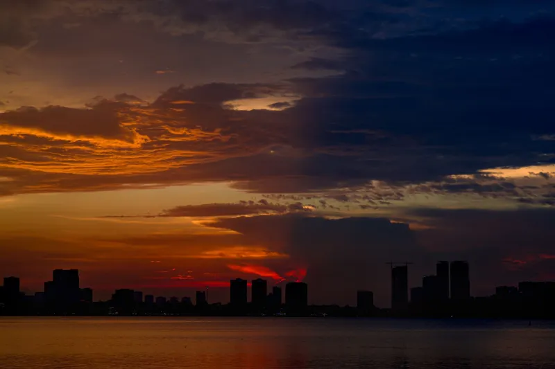
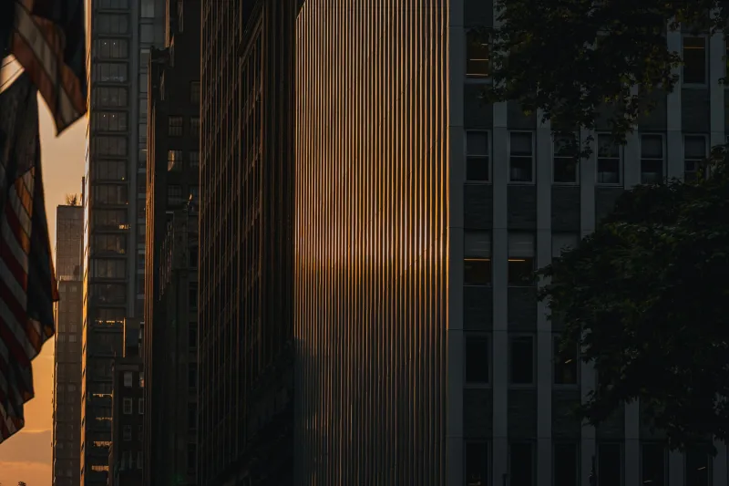
The Urban Palette: Color as Cultural Commentary
America's cities offer a different kind of color challenge entirely. In places like New York's Lower East Side, Chicago's Pilsen neighborhood, or the neon-soaked streets of Las Vegas, color is often chaotic, layered, and culturally loaded. Here, photographers must make decisive choices about what to include, what to exclude, and how to frame color relationships within a complex visual environment.
Street photographers working in urban environments frequently use color to draw the eye toward a single point of focus amid visual noise. A subject in a red coat against a grey concrete wall. The yellow of a taxi cab reflected in a rain-slicked street. These moments of chromatic isolation within a busy frame direct the viewer's attention with precision.
The key discipline in urban color work is editing your frame before you shoot — not just in post-production. Move your feet. Change your angle. Wait for a pedestrian in a distracting color to clear the frame. Color management begins in the field.
Building Your Own Signature Palette
The photographers whose work endures over decades tend to have something in common: a recognizable visual voice. Color palette is a significant component of that identity. Developing your own requires both study and experimentation.
Begin by auditing your existing body of work. Import your last three months of edited images into a single folder and view them as a contact sheet. What colors appear most frequently? Which images feel most authentically yours? This exercise often reveals instinctive preferences you were not consciously aware of.
Next, study photographers whose work resonates with you. Consider the work of Joel Sternfeld, whose large-format American photographs use color with quiet, almost literary precision. Or examine the Southwestern documentary work of Laura Gilpin, whose tonal choices brought a painterly gravity to her subjects. Identify the specific color decisions — not just the general aesthetic — that make their images distinctive.
Finally, commit to a palette for a defined period. Spend a month shooting and editing within a constrained color framework. Force yourself to find your subjects within those parameters rather than adjusting the parameters to fit your subjects. Constraint, in photography as in all creative disciplines, is frequently the mother of originality.
Color as Intention
The most important shift a photographer can make is from passive to active engagement with color. The light will always be what it is. The environment will offer what it offers. But the decision of how to frame, expose, and process what you see — those decisions belong entirely to you.
At Clor Images, we believe that where light meets vision, intention is everything. Color is not decoration. It is language. Learn to speak it deliberately, and your images will say things that no caption ever could.